spacestr

🔔 This profile hasn't been claimed yet. If this is your Nostr profile, you can claim it.

Edit
John Coulthart (Unofficial)
Member since: 2026-10-16
John Coulthart (Unofficial)
John Coulthart (Unofficial) 5h

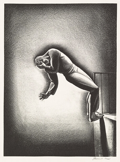
Weekend links 854 Nightmare (c. 1940) by Rockwell Kent. Happy Halloween. May all your horrors be cosmic ones. • “At that time, I was into a lot of esoteric philosophical stuff, and he was very hungry to learn about that. I gave him a list of obscure books, which he sent his girlfriend out to buy from Atlantis Bookshop in Museum Street.” Bill Nelson talking about working with David Sylvian in the 1980s. This minor detail makes the Kabbalistic/alchemical appearance of Russell Mills cover art for Gone To Earth seem less of a coincidence. • Coming soon from Strange Attractor: Light From The North: Aleksandra Ionowa – Mediumistic and Visionary Artist, edited by Nina Kokkinen & Vivienne Roberts. • At Little White Lies: Ryan Finnigan on the macabre convergence of FW Murnau’s art and life. One reason to defend the dilettante, then, is for lexicological justice. The term has been unfairly burdened with an overly negative connotation. It wasn’t always this way. From the Baroque-era Italian dilettante, the term originally referred to someone who pursues an interest, particularly an artistic one, for the sake of pleasure, or “delight”. Even as the term evolved, it stayed largely neutral, distinguishing enthusiasts from professionals in a given practice. The pejorative connotation familiar to us today is more recent, shaped by what I’ll call a “deficiency” model, in which amateurism is viewed negatively as a lack of something: skill, seriousness, focus, expertise. This is the meaning ascribed by cultural gatekeepers like Theodor Adorno, who in 1929 dismissed the dilettante as one “unable to establish any standards”. Jay Miller writes in praise of the dilettante • At Public Domain Review: Wonderful Weather: Floods and Foreboding in 17th-Century Britain. • MuGlobe: an interactive guide to the local music available via streaming services worldwide. • Mix of the week: A guest mix by Solypsis for The Invisible College. • At the BFI: Kelly Robinson chooses 10 great witch films. • New music: Land Of Ice And Fog by Jeff Greinke. • Andy Stott’s favourite albums. • RIP Patrick Stewart. • Nightmare (1938) by Artie Shaw And His Orchestra | Mysterious Semblance At The Strand Of Nightmares (1974) by Tangerine Dream | Nightmare (2015) by Rachel Mason https://www.johncoulthart.com/feuilleton/2026/10/31/weekend-links-854/ #rockwellkent #nightmare #museumstreet #atlantisbookshop #davidsylvian #aleksandraionowa #vivienneroberts #russellmills #ninakokkinen #strangeattractor #rss #feeds #linksharing #qwibbit
#rockwellkent #nightmare #museumstreet #atlantisbookshop #davidsylvian
John Coulthart (Unofficial)
John Coulthart (Unofficial) 4d

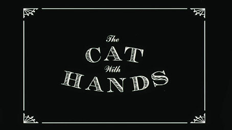
Three short films by Robert Morgan A little nightmare fuel for the run-up to Halloween. Robert Morgan is a British animator whose filmography to date has comprised a handful of short films plus a single feature, Stopmotion, which is on my future viewing list. All of his work is firmly situated in the horror sphere, a commendable stance when so many animators must be tempted by the financial rewards of advertising work and the pressure to make family-friendly comedies about cute characters with big eyes. The Separation. Two of the films linked here are very short so I won’t burden them with description. The Cat with Hands (2001) is one I’m sure I’d seen before, possibly on Channel 4 since the channel is credited at the end. Or maybe I dreamed something similar… With a running time of just over nine minutes The Separation (2003) is the longest and most ambitious of the three, a story of conjoined twins which is like David Cronenberg filming something of his own in the style of Dave Borthwick’s The Secret Adventures of Tom Thumb. Morgan’s oeuvre owes much to Borthwick’s animated grotesquerie. They Have Changed Their Faces is more of an experimental piece but very effective all the same; creepy in every sense of the word. If you like these there’s more to be seen at Morgan’s YouTube channel. They Have Changed Their Faces. Previously on { feuilleton } • The Secret Adventures of Tom Thumb • The Magic Art of Jan Švankmajer • Jiří Barta’s Labyrinth of Darkness • The Web by Joan Ashworth • Jiří Barta’s Pied Piper https://www.johncoulthart.com/feuilleton/2026/10/28/three-short-films-by-robert-morgan/ #robertmorgan #shortfilms #tomthumb #secretadventures #jiribarta #channel #daveborthwick #faces #davidcronenberg #jansvankmajer #rss #feeds #linksharing #qwibbit

#robertmorgan #shortfilms #tomthumb #secretadventures #jiribarta
John Coulthart (Unofficial)
John Coulthart (Unofficial) 6d

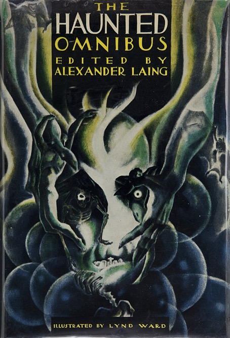
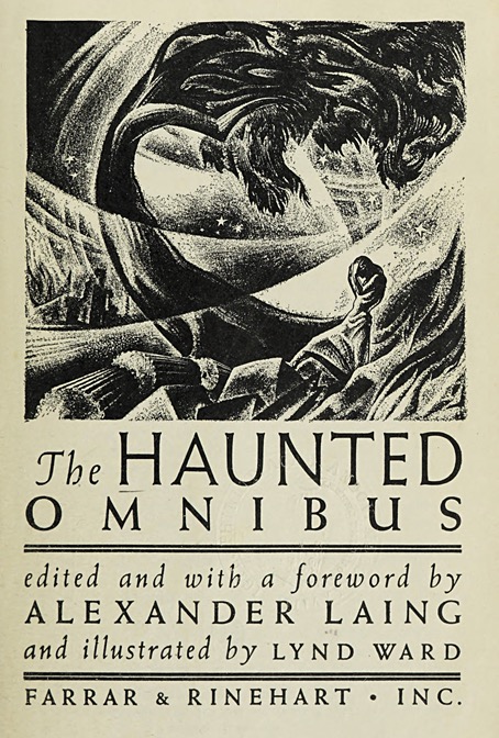
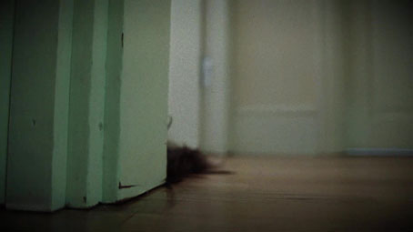
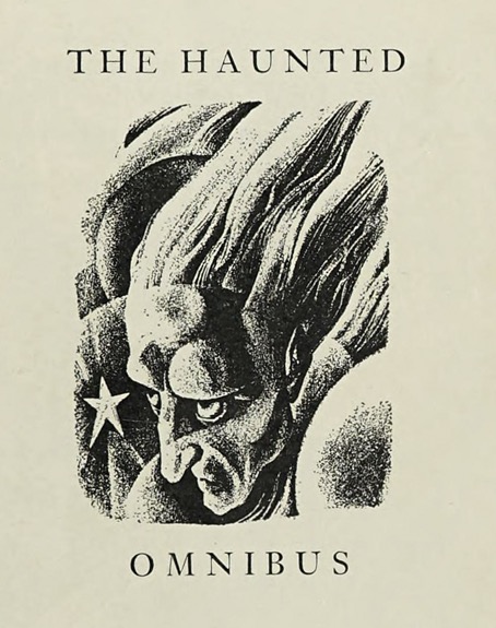
Lynd Ward’s Haunted Omnibus “The Haunted Omnibus” is a title that suggests some form of public transport filled with spooks, but all the spectres here are lodged in the pages of a story collection from 1937, edited by Alexander Laing and later reprinted in a truncated edition as Great Ghost Stories of the World. Both books were collections for American readers, with at least half the stories in The Haunted Omnibus originating in Europe. Many of the selections feature no ghosts at all; “weird tales” would be a better descriptor for any collection that includes entries as diverse as Guy de Maupassant’s The Horla, Arthur Machen’s The White People, Algernon Blackwood’s The Wendigo and an extract from Beowulf. Grendel aside, if you’re familiar with 20th-century weird fiction there are few surprises, the main attraction is Lynd Ward’s copious illustrations which, for the longer stories, run to two illustrations a piece: a title vignette and a full page. With 42 stories in total that’s a lot of artwork; what you see here is a necessary selection. The ISFDB page for the book links to a PDF scan of the entire collection if you’d like to see how well the illustrations suit the stories; alternatively, this old blog post has nearly all of Ward’s interior illustrations. Laing’s collection wasn’t Ward’s first engagement with horror, his superb edition of Frankenstein was published in 1934. This was followed by covers and a frontispiece for two of Alexander Laing’s novels, The Cadaver of Gideon Wyck (1934) and The Motives of Nicholas Holtz, Being the Weird Tale of the Ironville Virus (1936), which no doubt led in turn to The Haunted Omnibus. Ward’s Frankenstein illustrations are all wood engravings, a medium at which he excelled, and one which gives his drawings a precise definition that’s lacking in the story collection. I can’t say for sure what medium he used here but they look like lithograph drawings. The textural roughness is useful for conveying a nebulous atmosphere but Ward’s predilection for Expressionist distortion makes some of his depictions difficult to read at first glance. On the plus side it’s good to see how he deals with something like The White People which was being reprinted for the first time outside Machen’s own The House of Souls collection. This makes Ward the first illustrator of the story, as he was with The Wendigo and (I’m guessing) several more of these pieces. (Note: At the time of writing ISFDB is suffering problems with bots overloading its server resources but the PDF link directs to Alexander Laing’s entry on this page.) The Half-Pint Flask by DuBose Heyward. The Treasure of Abbot Thomas by MR James. The Yellow Wall Paper by Charlotte Perkins Gilman. The Wendigo by Algernon Blackwood. The Screaming Skull by F. Marion Crawford. The Horla by Guy de Maupassant. The White People by Arthur Machen. Markheim by Robert Louis Stevenson. Where Their Fire Is Not Quenched by May Sinclair. The Second Kalandar’s Tale from The Arabian Nights. The Gentleman from America by Michael Arlen. Casting the Runes by MR James. The Haunted Hotel by Wilkie Collins. The Grendel Episode from Beowulf. Afterward by Edith Wharton. Elsewhere on { feuilleton } • The illustrators archive Previously on { feuilleton } • Lynd Ward’s Beowulf • August Heat • Lynd Ward’s Frankenstein • Cain’s son: the incarnations of Grendel • Gods’ Man by Lynd Ward https://www.johncoulthart.com/feuilleton/2026/10/26/lynd-wards-haunted-omnibus/ #hauntedomnibus #lyndward #alexanderlaing #whitepeople #stories #arthurmachen #algernonblackwood #greatghost #weird #rss #feeds #linksharing #qwibbit

#hauntedomnibus #lyndward #alexanderlaing #whitepeople #stories
John Coulthart (Unofficial)
John Coulthart (Unofficial) 8d

Weekend links 853 Ghost Rider (detail, 1973) by Bruce Pennington. • Steven Heller’s font of the month is Dez Bollardian. My own font of the month is Nosferatu, a design by Sarah Salome Deletain and Jules Durand loosely inspired by the lettering on the German intertitle cards from FW Murnau’s Nosferatu – Eine Symphonie des Grauens. • The week in photography: Winners of the Nikon 2026 Microphotography Competition; Winners and finalists of the American Meteorological Society 2026 Photo Contest; The Lion Nebula as seen by the James Webb Space Telescope’s NIRCam (Near Infrared Camera) and MIRI (Mid Infrared Instrument). • New music: The Larsen Pipes 01 with Reza Mirjalali by The Larsen Pipes; Bound To Substance by Dodenskald & Wilted Perch. Their career itself can be seen as a kind of collage, in the way it brought elements from different places and periods together into the present. Their music was too eclectic to be comfortably of the moment. Futuristic jams like 1980’s Western Mantra shared a dynamic with the electronic funk then taking shape in New York and London, but was too fragmentary and generally weird for all but the strangest dancefloors. So the Cabs were sometimes too ahead of the curve for their own good, and while they were acknowledged as electronic music pioneers, they never parlayed that stature into consistent success and remained forever outsiders—where they were probably happiest. Derek Walmsley talks to Stephen Mallinder and Chris Watson about the end of the Cabaret Voltaire project • Coming soon from Strange Attractor: Panic: Visions Of The Horned God In The English Country Garden by Sara Hannant. • At the BFI: Ruby McGuigan on where to begin with Billy Wilder. • At Unquiet Things: The art of Hannah Flowers. • RIP Tom Skerritt. • (Ghost) Riders In The Sky (1961) by The Ventures | Ghost Rider (1969) by Musical Doctors | Ghost Rider (1977) by Suicide https://www.johncoulthart.com/feuilleton/2026/10/24/weekend-links-853/ #rss #feeds #linksharing #qwibbit

#rss #feeds #linksharing #qwibbit
John Coulthart (Unofficial)
John Coulthart (Unofficial) 11d

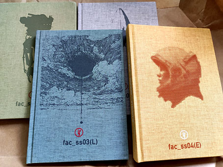
Li’l Factory My thanks to David Polfeldt at Li’l Factory for generously sending me copies of the first four books from his new publishing imprint. Li’l Factory is based in Sweden but publishes in English, and describes its mission thus: Li’l Factory is focused on publishing odd stories that find no other home. The authors may be young and looking for their first breakthrough, or they may be veterans sitting on material that is rejected by trad publishers. Li’l Factory aims to make a string of beautiful books that reach breakeven and gives the author a boost to continue their work. All the books published so far are science fiction, the first three of these—Burns by David Polfeldt, Brain Fruit by Stephen Oram, and Mimeograph by Eira A. Ekre—being short stories presented as standalone works. The fourth book—Into the Great by Elliot Blake—is novel length. At the time of writing I’ve only read the first three so it wouldn’t be fair to attempt a review of the quartet, but I can tell you that Burns deals with the solitary existence of a self-aware space probe searching for alien life; Brain Fruit is an account of a three-way act of symbiosis in which a bee, an i and a fruit have to work together as a single organism in order to advance their evolution; and Mimeograph concerns a near future in which replication machines (“Mimes”) have become so skilfully attuned to the needs of the people they serve that they start to remake the world, with increasingly dramatic consequences. Of the three I preferred Mimeograph, probably because it shades into horror in its second half, as apocalyptic science fiction tends to do. One thing all the books have in common is the care taken over their presentation, a combination of quality materials, good design and expert typesetting. Publishing books in this manner is always a brave and commendable act; brave because I know from my own experience with small publishers how hard it can be to flourish in a difficult market. But David Polfeldt is off to a good start, and the formatting and design could easily catch the attention of readers who like to collect books when they’re presented like this. His imprint isn’t concerned solely with science fiction either, the submissions page of the Li’l Factory website mentions that fantasy would also be welcome. The submissions window is currently open for anyone with a homeless (and suitable) manuscript. As for what might count as suitable, the taste references are a useful guide. https://www.johncoulthart.com/feuilleton/2026/10/21/lil-factory/ #rss #feeds #linksharing #qwibbit

#rss #feeds #linksharing #qwibbit
John Coulthart (Unofficial)
John Coulthart (Unofficial) 13d

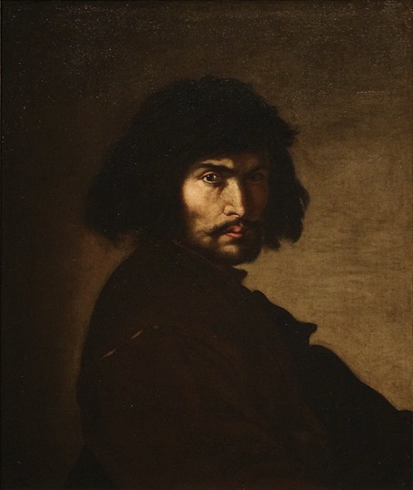
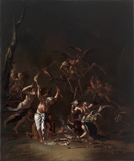
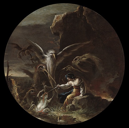
Salvator Rosa’s witches Self-portrait (1650). Weeds and briers reigned, and furtive wild things rustled in the undergrowth. Upon everything was a haze of restlessness and oppression; a touch of the unreal and the grotesque, as if some vital element of perspective or chiaroscuro were awry. I did not wonder that the foreigners would not stay, for this was no region to sleep in. It was too much like a landscape of Salvator Rosa; too much like some forbidden woodcut in a tale of terror. HP Lovecraft, from The Colour Out of Space My recent reading has included some of ETA Hoffmann’s stories, ostensibly his weird tales although there hasn’t been anything especially weird about the ones I’ve read so far. One of these, Signor Formica, is a novella-length piece with Italian artist Salvator Rosa (1615–1673) as the main character, a story that adds a layer of fiction to the rumours and apocrypha the artist accumulated like so many coats of varnish. Hoffmann has Rosa arriving in Rome where he spends little time painting and much more time operating as a highly proficient agent of vengeance for a younger artist. The real Rosa was proficient enough without anyone having to exaggerate his accomplishments. In his early life he trained as a musician; in the years when he was struggling to sell his paintings he worked as an actor, and had some success as a writer of satirical plays. The theatrical side of Rosa’s career is one that Hoffmann exploits in his story. The Witches’ Sabbath (c.1635/1654). Hoffmann says surprisingly little about Rosa’s paintings—a familiarity on the part of his readership seems to be taken for granted—but Signor Formica had me looking them up again, especially the more grotesque examples of which there are many to choose from. Rosa was somewhat ahead of his time in both his subject matter and its handling, providing an artistic link between the late Mannerists and the Romantics of the 1800s who would find much to admire in his dark and violent depictions of witches and the bandits of Southern Italy. The bandit pictures were especially popular in the 1800s but since we’re now in the Season of the Witch it seems fitting to look at Rosa’s witches, or those that are visible in the murk of his shadowy canvases. Rosa’s streghe are a fearsome lot, as are the nameless creatures who attend their ceremonies. The monsters you find in older paintings can often seem more comical than frightening but there’s little that’s comical about these snapping assemblages of slaughterhouse remains. Scenes of Witchcraft: Morning (c.1645–49). Scenes of Witchcraft: Day (c.1645–49). Scenes of Witchcraft: Evening (c.1645–49). Scenes of Witchcraft: Night (c.1645–49). Witches at Their Incantations (c.1646). A Witch (1646). The Witch (c.1647-48). Saul and the Witch of Endor (1668). Saul and the Witch of Endor; a print by Andrew Lawrence after Salvator Rosa (c.1718–1747). Witchcraft Scene (by a follower of Salvator Rosa) (c.1615–1673). Previously on { feuilleton } • Jan Parker’s witches • Witches https://www.johncoulthart.com/feuilleton/2026/10/19/salvator-rosas-witches/ #salvatorrosa #witch #signorformica #hoffmann #scenes #witchcraftscene #endor #rss #feeds #linksharing #qwibbit
#salvatorrosa #witch #signorformica #hoffmann #scenes
John Coulthart (Unofficial)
John Coulthart (Unofficial) 15d

Weekend links 852 Heaviness of Sleep (1938) by John Armstrong. • Suntup Editions are reprinting two stories by Arthur Machen: The Great God Pan and The White People will be presented together in a single volume, with corrected texts printed in letterpress. The book will also feature eight tipped-in lithographs by Flora McLachlan, and an afterword by Henry Wessells. • “While it mines much of the same material found throughout the horror genre, The Shout belongs to a parallel cinematic lineage—more art-house than grindhouse.” Leo Goldsmith on Jerzy Skolimowski’s film adaptation of the short story by Robert Graves. • The week in Borges: “I seeded my dreams and this story emerged”: Poet Will Dowd let Jorge Luis Borges speak to him in his sleep. And Nick James reviews Life of Jorge Luis Borges, a 323-minute documentary directed by Mariano Llínas. • At Smithsonian Magazine: “Venetian artist Canaletto merged fantasy and architectural detail in this previously unseen sketch”. • Devil in the detail: 100 years on, FW Murnau’s Faust scrapbook reveals the secrets of his silent masterpiece. • At Public Domain Review: Rudolf Kalvach’s Wiener Werkstätte postcards (1907). • At the BFI: Alex Ramon chooses 10 great black-and-white films of the 2020s. • At Colossal: Winners of the Wildlife Photographer of the Year 2026. • Mix of the week: A Samhain Mixtape at The Invisible College. • New music: Sleep Machines by O Yuki Conjugate. • Kali Malone’s favourite albums. • ∞ Infinite Jungle • Ordinary Sleep (1994) by Jessamine | First Sleep (2002) by Cliff Martinez | Black Sleep Part I (2008) by Jasper TX https://www.johncoulthart.com/feuilleton/2026/10/17/weekend-links-852/ #sleep #luisborges #jorgeluis #johnarmstrong #arthurmachen #suntupeditions #godpan #whitepeople #henrywessells #robertgraves #rss #feeds #linksharing #qwibbit
#sleep #luisborges #jorgeluis #johnarmstrong #arthurmachen
John Coulthart (Unofficial)
John Coulthart (Unofficial) 17d

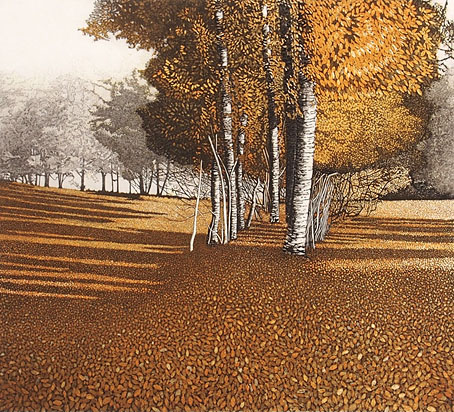
Weekend links 851 Amber Light, a print by Phil Greenwood. • “When I heard the term industrial music, I mistook it for techno and soon learned it was not.” Steven Heller talks to Chris Grimley and Alan Rapp about Industrial Music/Graphics: A Visual History of a Movement. • Halloween approaches, as does Ghosts on the Cam. Editor Robert Lloyd Parry talks to Swan River Press about his latest story collection. • “There we were, and we could be naked”: Stanley Stellar’s photographs are a record of gay life in New York from the 1970s onwards. She researched cultures in which dreams delivered prophetic truth-telling messages from a higher plane. Like splashes and blots, dreams emanated from hidden forces, perhaps of the human mind, perhaps not. She had a metaphysical belief in their potential to put her in touch with supernatural beings, not angels or demons in any religious sense, nor the fairies or phantoms of popular belief, but spirits posited by mystical systems such as astrology and alchemy, otherworldly manifestations raised by enchanters and magi who had developed means of contacting them. Marina Warner in a lengthy appraisal of the occult and Surrealist obsessions of Ithell Colquhoun • The October catalogue of lots for the After Dark: Gay Art and Culture online auction. Homoerotic art, photos, historic porn, etc. • At Wormwoodiana: Mark Valentine on the house that vanished, a literal ghost house. • At Colossal: “Amok Island’s geometric murals teem with vibrant local flora and fauna”. • At Public Domain Review: The Alchemical Transformations of the Mutus Liber (1677). • New music: Trinitatis by Deaf Center; Ancient Future by Bana Haffar. • Old music: Metal & Flesh by Hard Corps receives another reissue. • Mix of the week: DreamScenes – October 2026 at Ambientblog. • “My one political film”: Ken Russell on The Devils. • RIP Matt Howarth and Eva Marie Saint. • Amber (1980) by The Residents | Amber (1996) by Little Axe | Amber (1996) by Zoviet France https://www.johncoulthart.com/feuilleton/2026/10/10/weekend-links-851/

John Coulthart (Unofficial)
John Coulthart (Unofficial) 17d

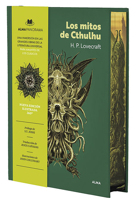
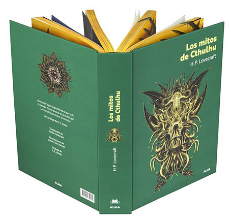
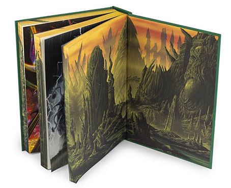
Los mitos de Cthulhu Appearing on Spanish bookshelves this month is Los mitos de Cthulhu, a 576-page story collection which I spent the first half of this year illustrating. This is my third illustrated Lovecraft for Editorial Alma, with an introduction by ST Joshi and translations by Jesús Cañadas, and is easily the biggest to date in both size and page count. The book is a hardback with an obi strip, and includes a feature which Alma have been applying to other titles in this series, with a single illustration (in this case a panorama of the risen R’lyeh) that covers the front and back endpapers while also wrapping across the sprayed page edges. You may have noticed that sprayed edges have become a minor trend in the publishing world especially with big collections like this one. The edition of Frankenstein that I illustrated for Alma was given sprayed edges when reprinted at a larger size in the USA and Poland but Los mitos de Cthulhu is the first book I’ve worked on where I’ve had to create something specifically for this effect. What I’ve yet to see is another publisher spraying the page edges with a single illustration that runs inside and outside the book. Where the interiors are concerned, the brief was to create ten full colour, double-page illustrations for a collection of twelve stories, with the choice of illustrations being left in my hands. This was obviously going to involve a lot of work but I was pleased to be given an opportunity to create a new series of digital paintings in full colour. In recent years I’ve done so much digital collage, monochrome drawing or vector illustration that the realistic painted side of my work feels unduly neglected. Some of the stories I ended up choosing were ones I’d illustrated before but a few of them I was tackling for the first time. In rough order of completion, the story list is as follows: The Call of Cthulhu Not my first view of R’lyeh but this is the first one I’ve done where the ruins look like they’ve been underwater for a very long time. The book’s endpapers were created last, when all the illustrations had been completed. This required adding an extension to the piece above, a tricky business with a digital artwork but not as difficult as it would have been using physical media. The Shadow Over Innsmouth This, on the other hand, is my first visit to Innsmouth. Since all these illustrations run across two pages I’ve tried to give both halves of each picture a point of interest while avoiding the placement of anything important in the centre. Among other things this has avoided my usual propensity towards compositions based on a central vertical axis. The Dunwich Horror Here once again is the story which has been filling most of my waking moments for the past two years… I’m still a long way from dealing with this climactic confrontation in my comic-strip adaptation, as a result of which I almost omitted choosing the story in order to save the surprise (for myself) until later. With scenes like these I try to avoid over-sketching anything. When I was drawing The Call of Cthulhu in 1987 I didn’t make any sketches of the real Cthulhu (as opposed to the statuary, etc) until the day I had to start drawing the page where the abomination emerges from its lair. I’d been planning on doing the same for the climax of The Dunwich Horror but I spent so long working on the perspective of those Innsmouth buildings that I wanted the next picture to be something that wouldn’t take an equivalent amount of time, and ended up sketching this scene in a couple of hours. Now that Wilbur Whateley’s monstrous brother has been revealed I’ll probably be doing something very similar to this scene for the comic-strip version. The Nameless City Despite having dealt with the ends of stories in the illustrations above I’ve generally tried to avoid being too spoilerish with these pictures. It’s easy to think that everyone knows all the stories by now but there will always be readers encountering them for the first time. This picture is a scene-setting piece for a story that ST Joshi describes as one of Lovecraft’s worst weird tales. I don’t think it’s that bad—it gives us our first quote from the Necronomicon while being a kind of sketch for At the Mountains of Madness—but the later scenes take place in narrow and very dark underground passages. I might have done something with one of these scenes for a single-page illustration but double-page spreads require something a little more grand and cinematic. At the Mountains of Madness From ruins in the sand desert to ruins in the ice desert. This is the scene from the middle of the story when the explorers’ plane discovers that the centre of Antarctica is home to vast architectural structures that shouldn’t be there at all. Lovecraft describes a vista of these ruined towers stretching for miles into the distance amid a labyrinth of smaller structures. If I was going to do justice to the story (and I’d still like to one day) the scene should really look like an extraterrestrial equivalent of Manhattan Island surrounded by mountains; but if I’d committed to that level of detail I’d probably still be working on the book today. Deadlines often force your hand, and by the time I was working on this picture I was worried I was falling behind in my schedule. Think of this, then, as the outskirts of the alien city, with much more still to be revealed. A note about the aircraft: Lovecraft mentions the Miskatonic expedition bringing with them four Dornier planes but doesn’t say which model of Dornier they use, a detail which caused a headache when I was looking for reference material. In the end I decided on a Dornier Do J Wal, a small flying-boat used by Roald Amundsen in a North Pole expedition which artist/Lovecraft scholar Jason C. Eckhardt had earlier identified as one of the planes used in the story. In addition to fretting over the aircraft details I also designed an emblem for the expedition. The Festival Another minor story which I hadn’t tackled before but, unlike The Nameless City, a tale with a visually interesting climax. The double-page composition worked out well for this one, a spiral arrangement that takes in the descent from the upper world, the robed figures gathering around a pillar of green fire, and the winged creatures flapping out of the underworld. The Shadow Out of Time With this one I was torn between inventing a very alien interior versus a more recognisable Earth-like scene. The latter won out, obviously, because the clock was ticking and I still had more stories to deal with. The Great Race of Yith are aliens but they’re also librarians and archivists so I’d expect them to inhabit an orderly environment while pursuing their project of documenting the entire history of the Earth. Lovecraft describes them occupying a series of huge towers, some of which, I suggest here, might have been constructed along Earth-like principles as a result of all their mind-swapping with the planet’s future population. The Statement of Randolph Carter Another one I hadn’t illustrated before. Lovecraft doesn’t give a location for the cemetery but it’s described as being located in an overgrown swampy region that may be somewhere like Georgia or Florida, hence the moss hanging from the trees. Through the Gates of the Silver Key This was the only picture of the ten that gave me any problems because I couldn’t get the colours of the sky to look the way I wanted. The story is one of several in which Lovecraft describes unearthly colours, here manifesting in the skies of another dimension. The finished picture shows the third draft of the sky which is a composite of about eight different layers that give the turbulent and liquid polychrome appearance I was after. Much of this was achieved using Glitch Lab, a photo-filter suite which has a prismatic distortion setting among its range of effects. I was intending to do more with the picture as a whole but by the time it was finished I’d hit the deadline and still had one more to do. The Rats in the Walls The climax of this story takes place in a vast cavern underneath the house but I’d already drawn one cave and was reluctant to do another. The cannibal theme of the story is alluded to by the bloody sunset and the red stains creeping up the walls of the buildings from the surrounding earth. The two unillustrated stories in the collection are The Thing on the Doorstep—rejected for being light on visual drama aside from brief mentions of a “pit of shoggoths”—and The Haunter of the Dark—rejected because I’d have to either spoil another climax (which in any case takes place in total darkness) or draw another building, and I’d recently drawn the real church that was the basis for the Starry Wisdom headquarters in Tachyon’s Lovecraft’s Brood. I was offered a couple more story options, among them Pickman’s Model which I nearly opted to include. The trouble with this story is that I’ve never found the idea of corpse-eating ghouls to be very interesting even though you obviously wouldn’t want to meet such a creature. And Lovecraft’s descriptions of Pickman’s paintings build up the expectations of the reader to such a degree that anything you do to illustrate one of these scenes is bound to be a disappointment, even if you can paint like Velázquez or Salvator Rosa. Now that this book is in print I imagine people will be asking me about a US edition. Nothing is planned at the moment but it remains a possibility even though the Lovecraft reprint market feels increasingly crowded, especially for Anglophone readers. People are still buying copies of older books despite the texts being freely available online. I never expected my edition of Frankenstein to be reprinted in the US because it’s so easy to find elsewhere, and I really didn’t expect it to sell the 20,000 copies that it subsequently did. The Lovecraft reprint market may be a crowded one but many of those editions are cheaply done and will be taking their texts from earlier printings of the stories like the ones in Weird Tales, some of which introduced typographic errors. Let the reader beware. Elsewhere on { feuilleton } • The Lovecraft archive Previously on { feuilleton } • Illustrating Lovecraft again • The Thing on the Doorstep https://www.johncoulthart.com/feuilleton/2026/10/12/los-mitos-de-cthulhu/

John Coulthart (Unofficial)
John Coulthart (Unofficial) 17d

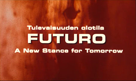
Futuro – A New Stance for Tomorrow Writing about Evoluon a couple of years ago I mentioned my affection for all those one-off Space-Age constructions with suitably science-fictional names: Evoluon, Skylon, Atomium, Space Needle… You could add Futuro to this list, a micro-building in comparison to the latter pair, with a similar flying-saucer styling as Evoluon. Futuro wasn’t a one-off design, however, but a prefabricated dwelling intended for mass production. The original plan by Finnish architect Matti Suuronen was for a plastic ski lodge that would be light, easy to assemble and quick to heat. The prototype he built in 1968 caught the imagination of investors, and other uses were soon proposed. The ski-lodge idea was thwarted by planning regulations but the Futuro was modestly successful all the same, and might have been a much bigger success in the United States if the oil crisis of 1973 hadn’t raised the cost of the plastics used in its construction. Enough Futuros were sold before production ended that many of them are now scattered around the world, some in better condition than others (see The Futuro House for details). One of the early models was bought in 1971 by the mayor of Todmorden, a small town in Yorkshire, which yielded the photograph below. There’s no mention of the Todmorden Futuro in Mika Taanila’s short documentary film, Futuro – A New Stance for Tomorrow, but we do get to see many of the others in photographs, brochures, magazine features and period footage. Taanila made his film in 1998 when Matti Suuronen and some of the people who worked with him or helped promote the Futuro were still around to be interviewed. The film isn’t greatly informative—we learn very little about the design or construction processes, or about potential drawbacks or problems—it’s more a snapshot of an era when industrial design was proposing radical solutions with new materials, plastics in particular. I find the whole idea of the Futuro inherently attractive, and I’d like to know why we don’t see more general-purpose architecture of this kind. Buildings with curved walls have never been popular as housing—furniture is difficult to site, and you can’t easily hang pictures or mirrors on a curved surface—but they can serve other purposes. The Futuro, like other buildings of its kind, gestures to a future that still hasn’t arrived. Previously on { feuilleton } • A Day of Expo 70 • Impressions of Expo 67 • Expositiana • Evoluon • The world of the future • Space Needle USA https://www.johncoulthart.com/feuilleton/2026/10/14/futuro-a-new-stance-for-tomorrow/

Welcome to John Coulthart (Unofficial) spacestr profile!

About Me

Unofficial automated RSS/Atom links to John Coulthart's work on personal illustration, art, books, and media-history writing. Original work is credited at the source; follow the source links. Zaps support the independent feed operator, not the author.

Interests

  • No interests listed.

Videos

Music

My store is coming soon!

Friends